@katiejolly6
on
Reproducible Cartography Tips in R: Inner Glow
Libraries to load
library(osmdata) # gathering data
library(tidyverse) # wrangling data
library(sf) # spatial wrangling
library(colorspace) # lightening colors
library(tigris) # gathering data
options(tigris_class = "sf")
TL;DR
Create an inner glow effect with negative buffers and lightening colors around a polygon.
ggplot() +
  geom_sf(data = green_lk_nb, fill = "#F0F0F0", color = "white") +
  geom_sf(data = green_lake_park, fill = "#6E9A81", color = "#6E9A81") +
  geom_sf(data = green_lake, fill = "#B5CEDB", color = "#B5CEDB") +
  geom_sf(data = green_lake %>% st_buffer(-20), fill = lighten("#B5CEDB", 0.1), color = "transparent") +
  geom_sf(data = green_lake %>% st_buffer(-40), fill = lighten("#B5CEDB", 0.2), color = "transparent") +
  geom_sf(data = green_lake %>% st_buffer(-60), fill = lighten("#B5CEDB", 0.3), color = "transparent") +
  geom_sf(data = green_lake %>% st_buffer(-80), fill = lighten("#B5CEDB", 0.4), color = "transparent") +
  # adding labels
  geom_sf_text(data = green_lake, aes(label = "Green Lake"), family = "High Tower Text", fontface = "italic", color = darken("#B5CEDB", 0.2), size = 5) +
  geom_text(data = nb_labels, aes(label = name, x = x, y = y), family = "Lato", color = "gray80") +
  theme_void()

Intro
One thing I really enjoy practicing is reproducible design. By that I mean recreating techniques usually done in a design software with code instead. In the past I’ve written about creating map cutouts and full-page spreads at least mostly in R (with some help from Inkscape). While that workflow is great, sometimes I want to be able to contain my final product in an R script that someone else can run.
My favorite things to design are maps, so that tends to be the topic of
my writing. I’ll just talk about a few tips in this post, but I am
hoping to write more in the future. I hope some of this will be useful
for maps in ggplot2, but also for thinking about how to be more
creative with design while only using statistical programming code (or
just not heavy CSS capabilities).
Inner Glow
First off, what is an inner glow? This map by [Sarah Bell]https://raw.githubusercontent.com/katiejolly/blog/master/ps://petrichor.studio/tag/cartography-tip/) uses an inner glow to create a “satin waterbody effect.”

The inner glow is an effect that can help add depth and texture to your map. When well used it draws the reader’s eye and creates a beautiful visual hierarchy, essentially lifting some elements from the page.
When I was thinking about how to recreate this effect in R (as closely as I could), I came across a post from Datawrapper about creating an inner glow in a locator map. The animation below comes from that article and illustrates how they used layering to get a glow effect.

The structure of ggplot2 makes layering quite natural. The most
challenging part is getting the colors right and knowing how to create
the layers. When thinking about what data to use for my example map, I
want something that lends itself well to highlighting one particular
area. I had recently seen a map from
Curbed on
the public art in Seattle’s Fremont neighborhood so I wanted to create a
static version of that.
Getting Data
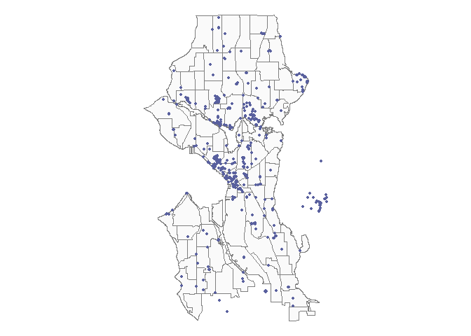
I’ve been learning more about pulling data from OpenStreetMap and I noticed they have data on public art so I wrote a query to pull data for Seattle.
public_art_q <- getbb("Seattle") %>% # within Seattle
  opq() %>% # create an overpass query
  add_osm_feature("tourism", "artwork") %>%  # with all public art features
  osmdata_sf() # and return that query as an sf object

public_art <- public_art_q$osm_points %>% # pull out just the point data
  st_transform(26910) # and use a UTM 10N projection
In total we have 726 listed public art points in Seattle.
Next I’ll pull in neighborhood data from the city’s GIS portal.
seattle_nb <- st_read("https://opendata.arcgis.com/datasets/b76cdd45f7b54f2a96c5e97f2dda3408_2.geojson") %>%
  st_transform(26910)
ggplot() +
  geom_sf(data = seattle_nb, color = "gray50", fill = "gray98") +
  geom_sf(data = public_art, size = .9, color = "#59609E") +
  theme_void()
Creating an inner glow in one neighborhood
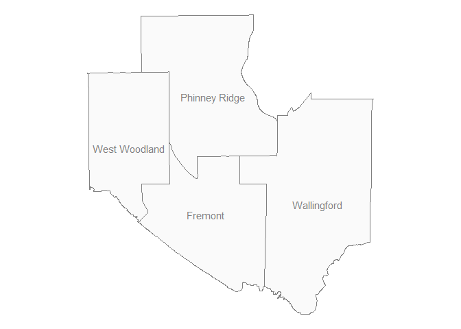
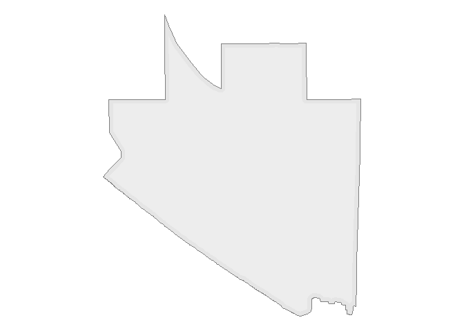
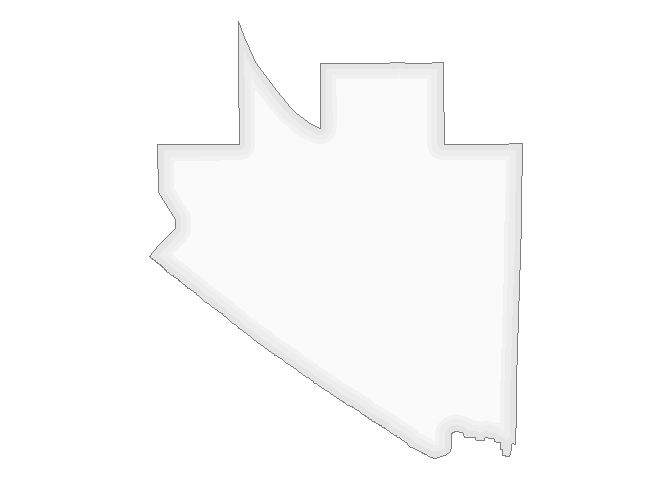
I’ll first isolate the Fremont geometry.
fremont <- seattle_nb %>%
  filter(S_HOOD == "Fremont")
And then get all of the neighborhoods that border it.
bordering <- seattle_nb[st_touches(fremont, seattle_nb)[[1]],]
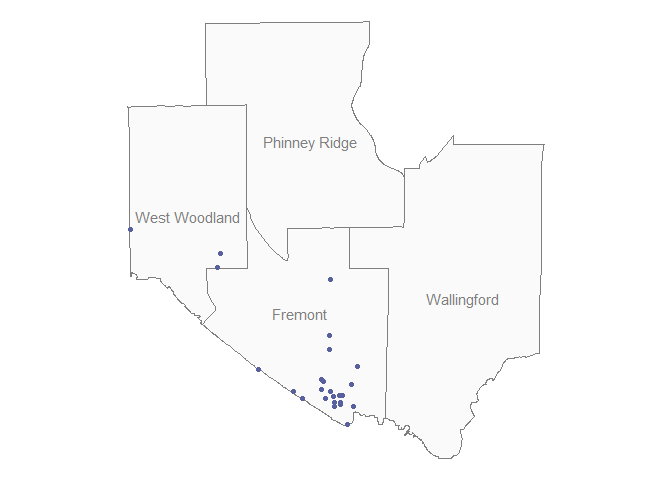
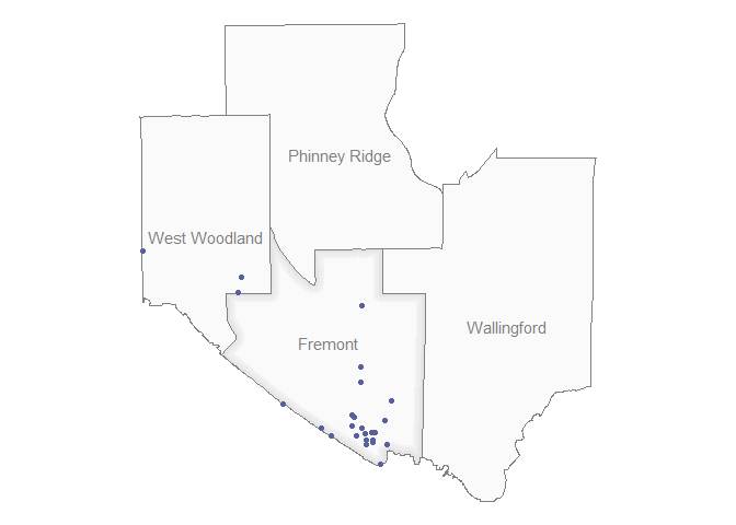
Then we can also pull the public art installations that fall in Fremont as well as the surrounding neighborhoods.
art_fremont <- public_art[st_intersects(fremont, public_art)[[1]],]

art_bordering <- public_art[st_intersects(bordering, public_art)[[1]],]
Next we can start the inner glow process. The general idea is to create layers with negative buffers to create iteratively smaller layers. The shapefile is in meters, the size of the buffer will be the number of meters we have between the two edges.
For example, if we start with the Fremont polygon and create just one
buffer layer you’ll start to see the effect. The key is in the fills,
keep the buffer color transparent. You’ll want to iteratively make the
fill lighter, this takes some trial and error.
ggplot() +
  geom_sf(data = fremont, color = "gray50", fill = "gray90") +
  geom_sf(data = fremont %>% st_buffer(-30), fill = "gray93", color = "transparent") +
  theme_void()
If you squint, you can see the faint shadowing around the edge. Adding a few more of these shadows gives the full effect!
ggplot() +
  geom_sf(data = fremont, color = "gray50", fill = "gray90") +
  geom_sf(data = fremont %>% st_buffer(-30), fill = "gray93", color = "transparent") +
  geom_sf(data = fremont %>% st_buffer(-60), fill = "gray95", color = "transparent") +
  geom_sf(data = fremont %>% st_buffer(-80), fill = "gray98", color = "transparent") +
  theme_void()
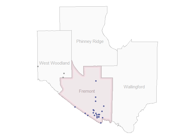
Now we can add the labels and surrounding neighborhoods again.
ggplot() +
  geom_sf(data = fremont, color = "gray50", fill = "gray90") +

  # start adding negative buffers here
  geom_sf(data = fremont %>% st_buffer(-30), fill = "gray93", color = "transparent") +
  geom_sf(data = fremont %>% st_buffer(-60), fill = "gray95", color = "transparent") +
  geom_sf(data = fremont %>% st_buffer(-80), fill = "gray98", color = "transparent") +

  # surrounding neighborhoods
  geom_sf(data = bordering, color = "gray50", fill = "gray98") +

  # fremont label
  geom_sf_text(data = fremont, aes(label = S_HOOD), family = "Lato", color = "gray50") +

  # surrounding neighborhood labels
  geom_sf_text(data = bordering, aes(label = S_HOOD), family = "Lato", color = "gray50") +
  # add the sculpture points
  geom_sf(data = art_fremont, color = "#59609E") +
  geom_sf(data = art_bordering, color = "#59609E") +
  theme_void()
To me, this is a pretty good shade and amount of glow. There’s no perfect map, though. To highlight the glow I want to deemphasize the surrounding neighborhoods by lightening the colors and then also picking new colors for Fremont.
ggplot() +
  geom_sf(data = bordering, color = "gray70", fill = "gray98") +
  geom_sf(data = fremont, color = "#A9989D", fill = lighten("#A9989D", amount = 0.6)) +
  geom_sf(data = fremont %>% st_buffer(-30), fill = lighten("#A9989D", amount = 0.7), color = "transparent") +
  geom_sf(data = fremont %>% st_buffer(-60), fill = lighten("#A9989D", amount = 0.8), color = "transparent") +
  geom_sf(data = fremont %>% st_buffer(-80), fill = lighten("#EDE6E8"), color = "transparent") +

  geom_sf_text(data = fremont, aes(label = S_HOOD), family = "Lato", color = "#A9989D") +
  geom_sf_text(data = bordering, aes(label = S_HOOD), family = "Lato", color = "gray70") +
  geom_sf(data = art_fremont, color = "#59609E") +
  geom_sf(data = art_bordering, color = "gray60") +
  theme_void()
Another example with water
I’ll also make an inner glow for some water in ggplot2 (piggy-backing
on the example I showed at the beginning). I’ll use Green Lake in
Seattle as an example.
green_lake <- area_water(state = "Washington", county = "King") %>%
  filter(FULLNAME %in% c("Green Lk")) %>%
  st_transform(26910)

ggplot(green_lake) +
  geom_sf() +
  theme_void()
To include some of the surrounding neighborhoods I’ll use cropping instead of the adjacency that I used above.
green_lk_nb <- seattle_nb %>%
  st_crop(., st_bbox(st_buffer(green_lake, 700))) # all area within 800 meters of the lake

ggplot(green_lk_nb) +
  geom_sf() +
  theme_void()
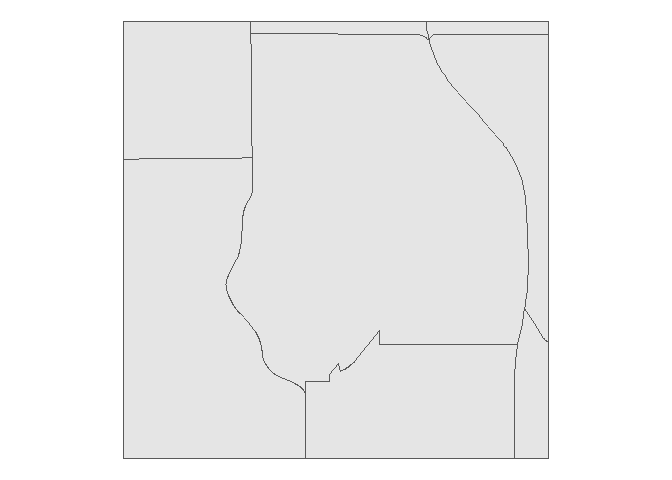
The main differences with selecting neighborhoods this way are that (a) neighborhoods won’t necessarily be entirely included, (b) the map will have a square shape, and (c) non-adjacent neighborhoods could be included if the adjacent neighborhoods are narrow enough.
To start I’ll plot the water over the neighborhoods.
ggplot() +
  geom_sf(data = green_lk_nb, fill = "gray94", color = "white") +
  geom_sf(data = green_lake, fill = "#92DEEA", color = "#92DEEA") +
  theme_void()
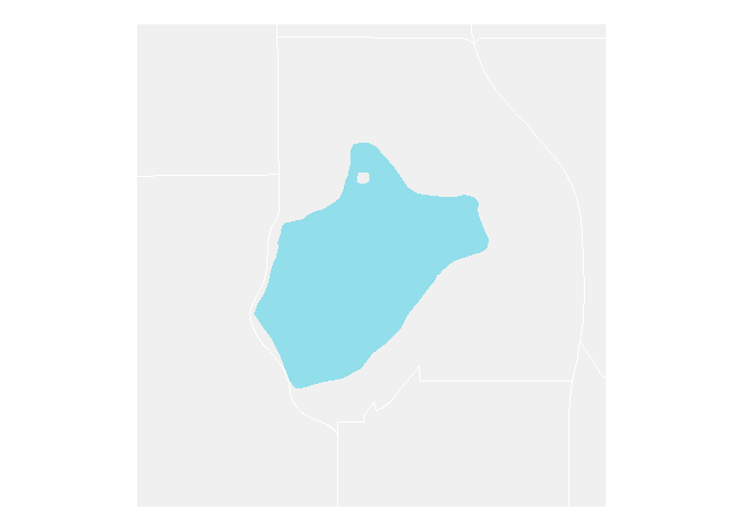
After looking at this map, I think that adding in Green Lake Park would provide some good context.
park_q <- getbb("Seattle") %>%
  opq() %>%
  add_osm_feature("name", "Green Lake Park")

park_sf <- osmdata_sf(park_q)

green_lake_park <- park_sf$osm_polygons
After pulling the park from OpenStreetMap, we can add it to the plot.
ggplot() +
  geom_sf(data = green_lk_nb, fill = "#F0F0F0", color = "white") +
  geom_sf(data = green_lake_park, fill = "#6E9A81", color = "#6E9A81") +
  geom_sf(data = green_lake, fill = "#B5CEDB", color = "#B5CEDB") +
  theme_void()
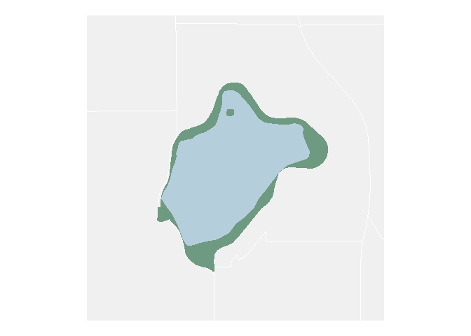
Now we can do the same layering that we did before to get an inner glow effect in the lake.
ggplot() +
  geom_sf(data = green_lk_nb, fill = "#F0F0F0", color = "white") +
  geom_sf(data = green_lake_park, fill = "#6E9A81", color = "#6E9A81") +
  geom_sf(data = green_lake, fill = "#B5CEDB", color = "#B5CEDB") +
  geom_sf(data = green_lake %>% st_buffer(-20), fill = lighten("#B5CEDB", 0.1), color = "transparent") +
  geom_sf(data = green_lake %>% st_buffer(-40), fill = lighten("#B5CEDB", 0.2), color = "transparent") +
  geom_sf(data = green_lake %>% st_buffer(-60), fill = lighten("#B5CEDB", 0.3), color = "transparent") +
  geom_sf(data = green_lake %>% st_buffer(-80), fill = lighten("#B5CEDB", 0.4), color = "transparent") +
  theme_void()
Now we have a map of Green Lake with some depth!
To add on to this map I might
-
Add roads
-
Add other points of interest
-
Add trails
-
Etc.
For now I’m just going to add some labels and save the other improvements for another post!
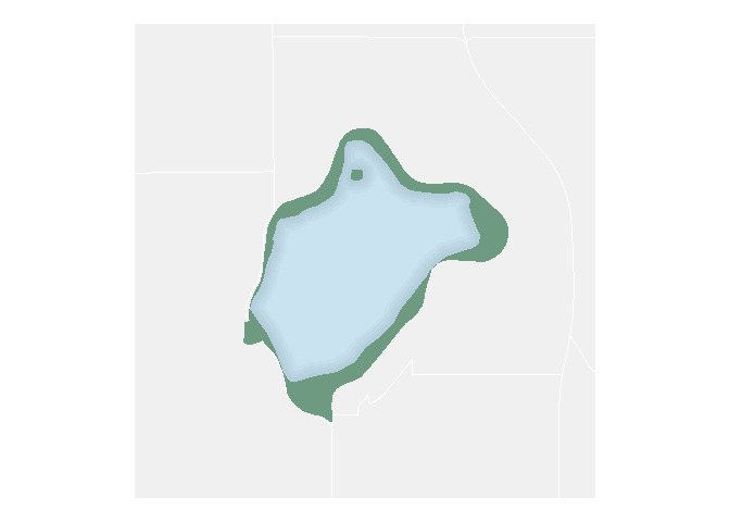
Labeling
Since the neighborhoods are man-made features, I’ll use a sans-serif font. For the water feature I’ll use a serif font. This is generally the industry standard.
ggplot() +
  geom_sf(data = green_lk_nb, fill = "#F0F0F0", color = "white") +
  geom_sf(data = green_lake_park, fill = "#6E9A81", color = "#6E9A81") +
  geom_sf(data = green_lake, fill = "#B5CEDB", color = "#B5CEDB") +
  geom_sf(data = green_lake %>% st_buffer(-20), fill = lighten("#B5CEDB", 0.1), color = "transparent") +
  geom_sf(data = green_lake %>% st_buffer(-40), fill = lighten("#B5CEDB", 0.2), color = "transparent") +
  geom_sf(data = green_lake %>% st_buffer(-60), fill = lighten("#B5CEDB", 0.3), color = "transparent") +
  geom_sf(data = green_lake %>% st_buffer(-80), fill = lighten("#B5CEDB", 0.4), color = "transparent") +
  # adding labels
  geom_sf_text(data = green_lake, aes(label = "Green Lake"), family = "High Tower Text", fontface = "italic", color = darken("#B5CEDB", 0.2), size = 5) +
  geom_sf_text(data = green_lk_nb, aes(label = S_HOOD), family = "Lato", color = "gray80") +
  theme_void()

I don’t like how the default labels look, so I want to move them around
manually. I also want to only include Wallingford, Phinney Ridge,
Green Lake, and Greenwood. I got the starting x and y values
from the polygon centroids with
st_centroid().
nb_labels <- tibble(name = c("Wallingford", "Green Lake", "Phinney Ridge", "Greenwood"),
                    x = c(550260.2, 549983, 548826.7, 548774.5),
                    y = c(5279708, 5281789, 5280043, 5281749))
ggplot() +
  geom_sf(data = green_lk_nb, fill = "#F0F0F0", color = "white") +
  geom_sf(data = green_lake_park, fill = "#6E9A81", color = "#6E9A81") +
  geom_sf(data = green_lake, fill = "#B5CEDB", color = "#B5CEDB") +
  geom_sf(data = green_lake %>% st_buffer(-20), fill = lighten("#B5CEDB", 0.1), color = "transparent") +
  geom_sf(data = green_lake %>% st_buffer(-40), fill = lighten("#B5CEDB", 0.2), color = "transparent") +
  geom_sf(data = green_lake %>% st_buffer(-60), fill = lighten("#B5CEDB", 0.3), color = "transparent") +
  geom_sf(data = green_lake %>% st_buffer(-80), fill = lighten("#B5CEDB", 0.4), color = "transparent") +
  # adding labels
  geom_sf_text(data = green_lake, aes(label = "Green Lake"), family = "High Tower Text", fontface = "italic", color = darken("#B5CEDB", 0.2), size = 5) +
  geom_text(data = nb_labels, aes(label = name, x = x, y = y), family = "Lato", color = "gray80") +
  theme_void()
This map is pretty good for a sketch! If there are other cartographic techniques you’d like to learn how to do in R, let me know and I can include it in a future post.